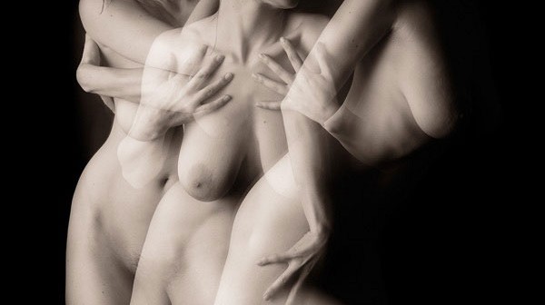
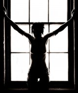
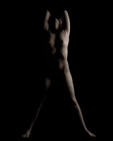
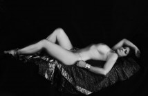
Alex Wilson is a prolific photographer whose website gallery offers up hundreds of diverse and exciting images of the female body. Some of the themes that I was draw to and found consistent across his body of work were the explorations of contrast, movement, detail, and camouflage.
Wilson works both in black and white and in color, though there are far more black and white images on his site. While he frequently and successfully makes use of rich dark backgrounds and shadows, he also explores the opposing idea of lack of contrast in images that are almost painfully bright where skin and bodies look like porcelain.
Wilson also works with dancers, and bodies in motion. Both in a traditional sense- with nude dancers, in classic poses en pointe, and in an experimental sense with blurred bodies and of multiple exposures layered on top of one another to create dynamic compositions. While there are an abundance of full body images both in shadowy settings and in bright factories to explore, Wilson also tackles the detail of the close-up view that a camera affords. Fine hairs, pores, goose bumps, stretch marks, and scars are all documented in sharp clarity.
Wilson about his gallery tags & web experiment
But perhaps one of the more interesting things about Alex Wilson isn’t his work at all but rather how he chooses to share it through his experimental online gallery of his work and through his blog. I asked Alex to elaborate on how he saw the internet and his gallery as part of the experience of viewing his work:
“Online, people are very used to seeing album hierarchies, and a linear ordering of the images in each album. Being able to “tag” something, as you can with images on Flickr, or links in del.icio.us, allows you multiple different associations between like things. What I wanted to do with my gallery experiment was strip away the concept of albums or directories altogether, and have images only shown as groups based on a set of tags. The neat part, to me it least, is the side set of thumbnails that lets you change the current set. I wrote some code that creates a score for how similar the tags of two images are, and it will show an image that has a high number of matching tags but that is not in the current set. These methods give the user a way to navigate to different sets, if you like an image, you click on it, and the gallery will show you more images that are like that one.
I think the end result is interesting, though, since the randomness and imposed interaction means a different experience for each viewer. I think that depending on the path you end up taking through the images can mean a different experience even when looking at a lot of the same images — which I think makes an interesting point about context and how the images we’ve seen previously can shape our framing for what we are looking at now.
The web is wonderful in the way that such experiments are possible, and that you can get such feedback. I often refrain from editorializing my images, since I find that the comments about it can reveal so much about how people interpret it. The blog has been great for that, as has posting work to sites like DeviantArt. When working themes of
ambiguity, especially, it’s very interesting to find out what people think — more often than not, the comment reveals much about the viewer. In a sense, I think the comments can become part of the work itself.”
article by Kayla
echo adrotate_group(5);
